Are you looking for an economical way to grab your readers’ attention? Do you want to build a spectacular email list for effective marketing? Then a splash page can help you achieve your goals.
This article will give you everything you need about splash pages. You will learn what they are and what benefits can offer you. You will also find examples from which to get inspiration and the best practices to create yours.
What Is a Splash Page?
Let’s start by defining what a splash page is.
When visiting your website or accessing your in-store WiFi, a splash page is the first web page. It greets visitors with engaging images, messaging, or animations.
Other words for this page are splash screen or welcome screen. Businesses use these pages in different contexts and for different purposes. Therefore, the effectiveness of a splash screen depends on your business.
For example, in the case of a local business offering WiFi to their customer, the most common splash screen is the captive portal. That is the page users face when trying to connect to the internet.
As with any page requiring user action, the splash page must be engaging and straightforward to interact with. Otherwise, users may abandon the page without moving forward.
Let’s now have a look at the common types of splash screens.
Most Common Splash Page Types
The content for all splash screens is different. Some provide updates, while others ask for visitors’ information. Here is a list of some of the types and their goals.
- Welcome Page: This type of splash page greets and welcomes visitors. It includes an overview of the website’s content and purpose. These pages make your user feel connected and informed.
- Promotional Page: Use this page to promote your services or products. It may include a call to action, such as signing up or a special offer.
- Captive portal: It requires users to input information to connect to a business WiFi. It can help business to collect useful data to run marketing campaigns.
- Age Verification Page: Websites with age limitations, such as edibles and cannabis, use this page type. It usually prompts users to confirm their age.
- Login Page: A login page allows users to log in to a website before accessing its content.
- Coming Soon Page: This page promotes an upcoming product or service. It is perfect for creating anticipation and interest around the subject before its release.
- Maintenance Page: Maintenance pages indicate a website undergoing construction, maintenance, or updates. This is better than taking down the website altogether to continue nurturing relationships.
- Error Page: This page appears when an error or problem occurs with the website. It should contain a message explaining the issue and providing instructions on resolving it.
3 Splash Page Examples To Take Inspiration From
As mentioned before, the effectiveness of a splash screen depends on the purpose.
It can be useful to look at other websites to create an engaging splash page that does the job nicely. See what they are doing and how they have set their splash screens. Then compare your idea to theirs. This will help you create an effective page that grabs attention and achieves goals.
But with so many brands out there, gathering inspiration can become difficult. So, we have curated a list of the three best splash page examples to help you find inspiration.
McDonald’s: Straight to the Points
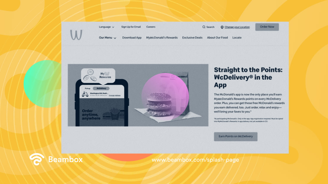
McDonald’s makes number one on this list because it has incorporated all of the components of a good splash page. When used to state the benefits for the user, a splash screen can become the best marketer for you.
This page aims to promote the products and the loyalty program run by the fast food chain. It starts the interaction by informing visitors that they can earn points if they order through the app. It uses its logo, typography, colors, and delivery paper bag. It is the perfect example of a branded splash screen. Moreover, it uses clever wordplay for the headline.
Getting straight to the point of the splash screen, it writes, “Straight to the Points: McDelivery in the App.” The clear CTA, “Earn Points on McDelivery,” states what the user will get. It has also added a screenshot of the app. Using its most famous burger for the visuals creates a connection in the visitors’ minds.
Skyline: Preview of the View
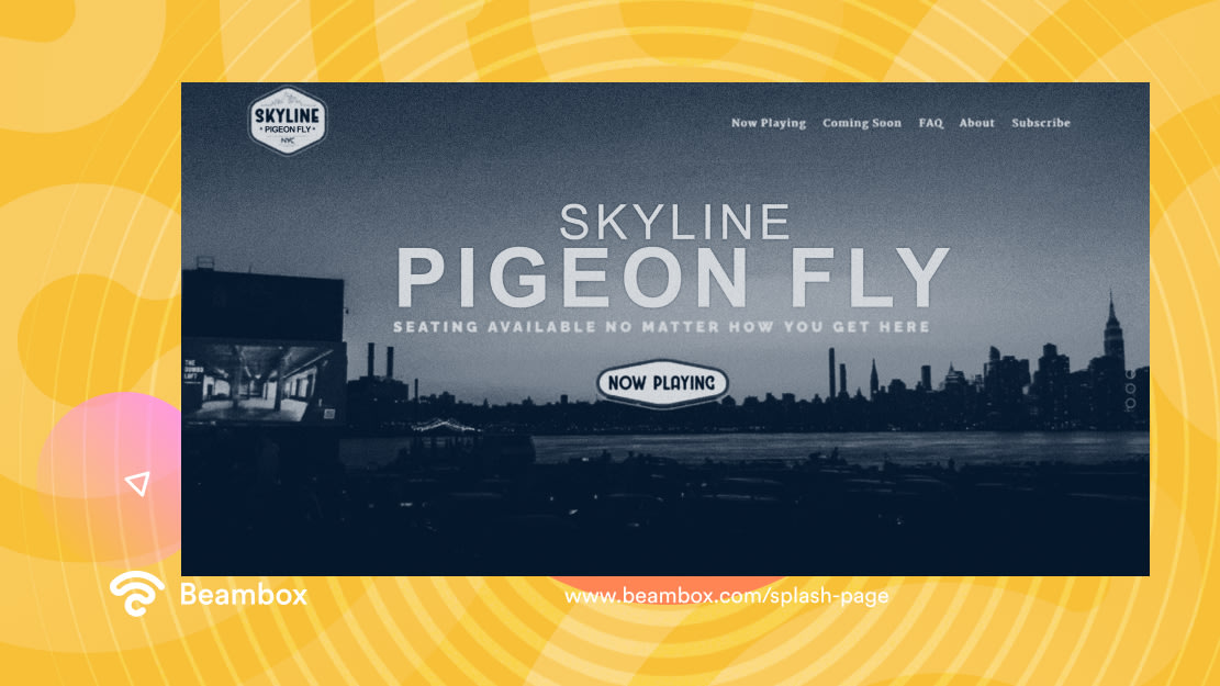
Skyline is a theater with a dedicated parking lot where people can watch movies from their cars. It does a perfect job of grabbing visitors’ attention. During sunset, the view of this place becomes breathtaking. Using this to its advantage, Skyline shows the view preview on its splash page.
The catchy headline “Drive In. Bike In. Walk In.” grabs attention and sticks to the readers’ minds. It also uses a short sentence, “Seating available no matter how you get here,” to describe the benefits to the visitor. It also uses its logo and typography to create brand familiarity.
The call to action, “now playing,” takes visitors to the page. It works because it’s simple yet clickable. Tabs such as coming soon, FAQ, and About make it easier for visitors to navigate the website.
Gimme Some Oven: Deliciousness in a Newsletter
Email marketing is one of the most effective ways to engage with customers and build loyalty for hospitality businesses.
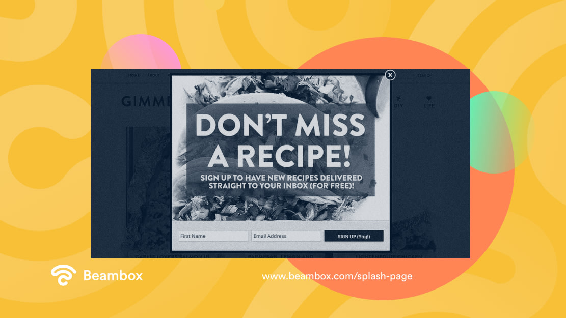
Gimme Some Oven is a recipe blog that prompts you to sign up for its email newsletter when you open the website. It is an excellent example of a splash page because it provides what the user came for. It also lets the page close if the visitor is uninterested.
It uses FOMO (fear of missing out) for the headline by saying, “Don’t miss a recipe.” It explains the benefit clearly and concisely, “sign up to have new recipes delivered straight to your inbox (for free)!” It also uses appealing images of tacos to give users a feel of the recipes they will get.
Keeping the process simple, it has only included a field for the first name and the email address. The CTA “sign up (yay!)” is short and brings a smile to the visitors’ faces.
Free Splash Page Websites
Now that we have discussed some great examples, let’s see if there are free splash page websites to create yours. Website builders like Wix, Carrd, and WordPress are excellent options for building a splash screen. They offer tons of templates with free plans. However, these plans may lack some functionality.
Moreover, these websites help you build complete websites instead of splash screens alone. Creating a customized splash page is tricky, and templates usually need to be customizable. Suppose you buy a template but change your branding, or it becomes outdated. You will have to buy another one.
If you run a local business, the simplest solution is to use WiFi marketing software. These solutions allow you to create custom WiFi splash pages that suit your goals and brand. Moreover, you do not need technical knowledge to do it right.
How Do Businesses Benefit From a Splash Page?
A splash page can do wonders for customer acquisition, retention, and marketing when done correctly. Some of the advantages that it offers are:
- Capturing Attention: A clever splash screen can capture people’s attention and make a solid first impression. It can spark your readers’ interest and entice them to browse the website.
- Promotion: It helps you promote your services or products without an ad campaign. You can also use it to launch email loyalty programs. This will lead to an increase in conversions and achieve business objectives.
- Targeted Messaging: A splash screen can help you provide a targeted message to a specific audience or customer segment. With this type of messaging, you can improve relevance and engagement.
- Improving Website Navigation: You can provide visitors a gateway to the main website through your splash screen. This will improve navigation and reduce bounce rates.
- Collecting User Data: A splash page can help you build an email list by capturing user data. It also enables you to record survey responses.
Splash Page Best Practices: Do It Right!
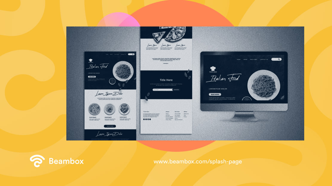
Some things can make or break the impact of this web page. Here are some of the best practices for creating an effective splash screen:
- Use Visuals: The design of this page should be visually appealing and relevant to the brand. Use images, videos, and animations. You can even add an interactive game to keep the users engaged.
- Create a Catchy Headline: Use a short but impactful headline that can grab your visitors’ attention. It should communicate the main message or value proposition of your website.
- Include a CTA Button or Link: The CTA encourages visitors to visit specific websites. Keep it clear, simple, and prominent to avoid any confusion.
- Provide Navigation: Avoid adding too much information but provide the visitor with a few navigation options. Allow them to access other pages of the website if they wish quickly. If visitors feel they need help, they might leave your website.
- Include the Branding: Reflect your branding on this page by including the logo, colors, typography, and brand language. This ensures consistency and creates an image of your brand in the visitors’ minds. It would also be a good idea to implement customer engagement strategies.
- Optimize Loading Time: It is essential to optimize the loading time to avoid negatively impacting user experience. You can optimize graphics to the correct size and minimize unnecessary scripts and plugins.
- Use Responsive Design: An effective splash screen is easy to view and navigate on all devices. So, optimize it for desktops, tablets, and smartphones.
- Allow to Skip: Some visitors prefer to go directly to the website’s content. A splash screen may be an annoyance for such people. So, make it easy for your visitors to skip this screen.
Splash Page vs. Landing Page
A splash page and a landing page are standalone web pages that serve a specific purpose. But it is essential to understand how they differ. This section will discuss “splash page vs. landing page” to help you understand the key differences.
A splash screen is typically a brief page that grabs attention. You automatically display it before a user reaches the main website. Its primary purpose is to engage the users and direct them to the main website or a specific goal or action.
Meanwhile, users get to a landing page after clicking a specific link. Its purpose is to convert users by providing them with specific information. It encourages users to take action, such as making a purchase. It achieves specific business objectives, such as generating leads or sales. These pages have an average conversion rate of 7%.
How To Make the Most Out of Your Splash Page
A splash page can be a powerful marketing tool depending on the needs of your business. However, it is crucial to choose the right type. A welcome screen is always a good idea, while promotional messages for new users may be inappropriate. So, choose what you need and make it engaging.
With Beambox’s WiFi marketing platform, you can create splash pages simply and transform your WiFi into a powerful marketing tool. You can use Beambox to gather customer data, automate marketing initiatives, and manage your network.
Get started today with Beambox’s free thirty-day trial and unlock the full potential of your WiFi!
Get Started With Free WiFi Marketing
Beambox helps businesses like yours grow with data capture, marketing automation and reputation management.
Sign up for 30 days free